

Google Aria Case Study
Overview
Client
In this hypothetical scenario, Google Aria is a combination of a wearable patch and mobile app that helps people monitor and manage their asthma. Google has been investing more in healthcare recently and they have contacted me to help them with this brand new application. The app will be developed first for Android, adhering to Material Design and Google guidelines.
My Role
My goals in creating the app were to determine the ideal user for an asthma-monitoring app and to make the features of the app the most informative and helpful for the user to monitor and manage their condition. I found this project particularly interesting because I suffered from asthma as a child, so I can definitely empathize with fellow asthma sufferers.
Research
I researched competitor apps, and noted that all of the apps tracked how users were feeling, their symptoms, triggers, medications, and treatment plans. Some of the apps allowed the user to share their information with a healthcare professional. Many of the apps had a bland, very medical interface and were confusing to navigate. I planned to make my app easier to navigate and more colorful and fun to use.
I then prepared a survey for asthma sufferers. I asked them how long they have had asthma, what triggers their asthma, and how they monitor and manage it. The answers were insightful - I found that everyone has several things that triggers their asthma but all have it under control. None of them use technology to track their condition, and almost all of them mentioned weather as a major asthma trigger. Because none of them use technology to track their asthma, I concluded that I needed to make my app as easy to use as possible, as most of the users would be first-time users. I determined that I needed to develop an app that offered the following features:
Allow users to easily track their symptoms
Provide local weather information
Allow users to share information with a medical professional for treatment and monitoring
Define
Persona
Based on my research, I created a persona for the individual who uses the Google Aria app. The persona is a 42-year-old married daycare aide who lives in Austin, TX named Amy Cohen. Since humid weather and pollen aggravates her asthma, she stays inside a lot. She enjoys a lot of indoor hobbies, and she has to manage stress, which also triggers her asthma. She daily monitors her peak flow and carries her inhaler with her everywhere.

Based on my research and survey, I determined what pains and gains would influence design decisions. All the survey participants reported several asthma triggers, including weather, vitals affected by their condition, and daily management of their condition with medication. This feedback was very helpful to determine my users’ goals and needs.
Information Architecture
Sitemap
Based on a card sorting exercise that I conducted with some willing participants, I worked out the structure of my app. From the information gathered, I determined what categories should be features in the bottom navigation, which is prime real estate in an app. And then I drilled down from there, determining the interaction between the top categories and subcategories. I created an application map showing the relationship between content in the app.

Design
Sketches
I started with some quick sketches of the Google Aria screens before wireframing my screens. This helped me to get an idea of what my screens would look and feel like.
Interaction Design
I created a task flow and a user flow to map out how the Google Aria app would work for a user. This was helpful to map out the different features and screens a user would encounter and experience as he or she navigated through the app.
Wireframes
Based on my previous research, I created some low-fidelity wireframes for the Google Aria app. I focused on creating simple, easy-to-read and use screens that were informative but interesting.
Low-fidelity wireframes
Visual Design
I created an app that adheres to the Google Material Design guidelines for color and layout. It was a little bit limiting to have to use the Roboto font, but using the same font does make the entire system consistent. From the Google Material Design palette, I purposely chose bright colors that evoke a cheerful, hopeful and fun mood. I wanted to avoid drab, washed-out colors and gravitated instead to saturated and stimulating ones. Adhering to my bright color palette, I wanted to create an icon that evoked an airy and friendly mood, so I created an icon that reminds me of the parachute for a parasail. Since I know what it is like to struggle with asthma, I felt that this app should brighten a sufferer’s day rather than dampen it, so I chose colors and a layout that would contribute to that.

High-Fidelity Wireframes
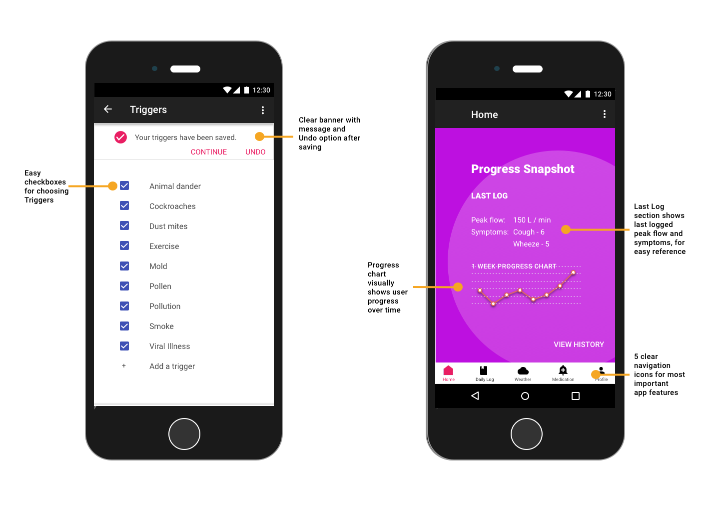
Adhering to my color palette and wireframes, I created the high-fidelity wireframes, adding details and color to enhance the user experience. Below are select screens with annotations describing the purpose behind my design choices.

Daily Log
I wanted to make logging symptoms as easy as possible while allowing the user to share as little or as much information with their healthcare professional as they chose. So I broke out the Daily Log into sections for:
Symptoms
Peak Flow
Vitals
Triggers
Share
Here’s the user flow through just logging symptoms and sharing them with a doctor.
Testing
I tested my high fidelity prototype of the Google Aria app with 3 primary test objectives: 1) ability to complete task of adding symptoms, peak flow, vitals, and triggers 2) ability to complete the task of sharing information and 3) experience and assessment of overall app design. View the prototype below.
The positive feedback was that the prototype had a bright and straightforward design that was easy to navigate and provided a lot of useful information. However, the negative feedback was that the app needed more details regarding the share feature, the date range, and confirmation of actions.
In response to the feedback from users, I made changes to my prototype. I added confirmation banners, removed the floating "Add" button to avoid confusion, and made some other minor design changes.
Next Steps
The next step would be to iterate again based on user feedback to improve the prototype. I would interview users to see if the app actually helped asthma sufferers to monitor and manage their condition. I would also ask users if they found the app easy, helpful, and pleasant to use. A further step would be to link the app to a wearable device that automatically logs some of the user’s vitals, such as heart rate, blood pressure, and peak flow.